
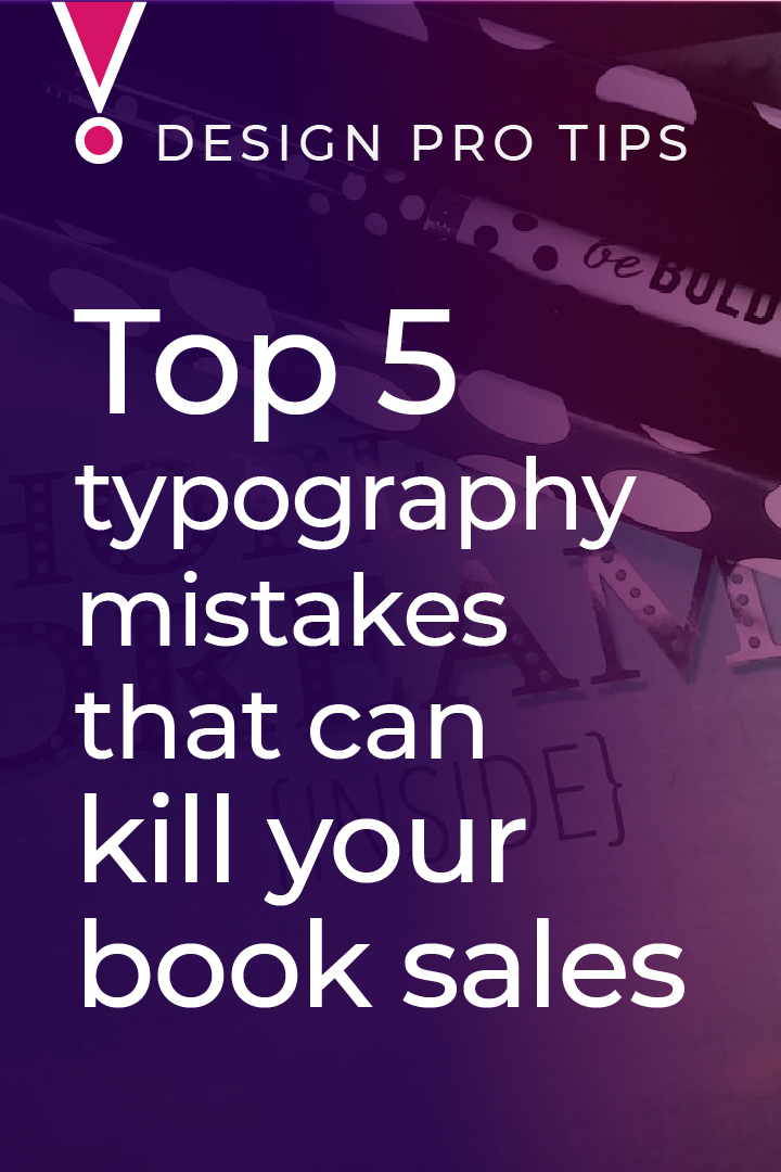
If there’s one thing that drives a designer completely freaking insane, it’s awful fonts. Well, okay, it’s not so much the fonts themselves, it’s how they’re styled. So often, you can spot a DIY book cover design because of wonky looking typography. So let me save you some heartache (and keep your readers from wanting to stab themselves in the eye with a fork) with this list of typography mistakes that can kill your book sales.
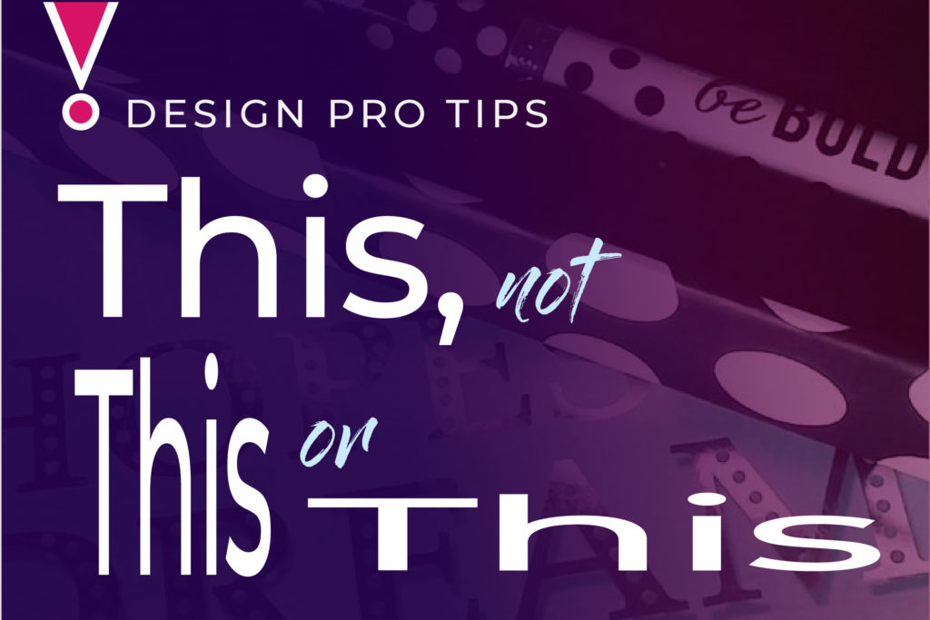
See how it distorts the letters and destroys the balance? In the original version, all the strokes are at an even weight. When you stretch or squish it, suddenly you have thick strokes & thin strokes, and it looks off because this typeface was designed to be all even. You can really see it in the way the "s" stands out - it looks like it's a different weight than the other characters. It isn't as purely vertical/horizontal as the rest, so squishing or stretching affects it differently. It's all fuglified (yes, I said fuglified!).
Now, I'm a rule-breaker, so I'm going to admit this to you: you can get away with a tiny bit of squishing or stretching. I'm talking 3 percentage points, max, and you need to keep an eye on how the letters look in relation to each other. But if you have to, 98% horizontal width probably isn't going to send any puppies to hell. Much more than that, and things get really fugly.
And ooh, ooh, ooh! It just came to me! Even if you're not working with a designer on anything right now, or doing your DIY cover design thing, this matters in another way:
Squishing yourself into a space that isn't enough for you. Stretching yourself out to cover more space than is good for you. It's bad for design, and it's bad for your life.
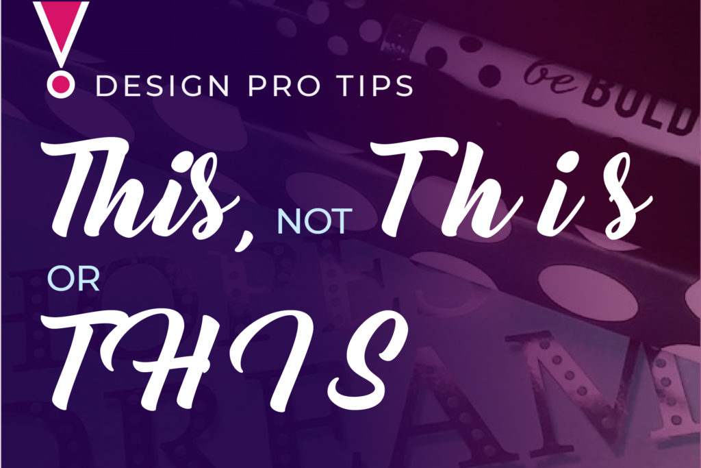
Many script fonts are designed to mimic cursive handwriting. The letters flow together (as if you never took your pen off the paper) because they're designed with connecting tails that are meant to touch the next letter. When you space out a script font wide, those connections are just hanging out in mid-air, looking goofy and awkward (like me at a party, until I find the host's dog to hang out with).
And all caps in a script font...well. Remember when I said I'm a rule-breaker? Not this rule. This one's right up there with no murder. It's fugly and SO WRONG. Don't do it.
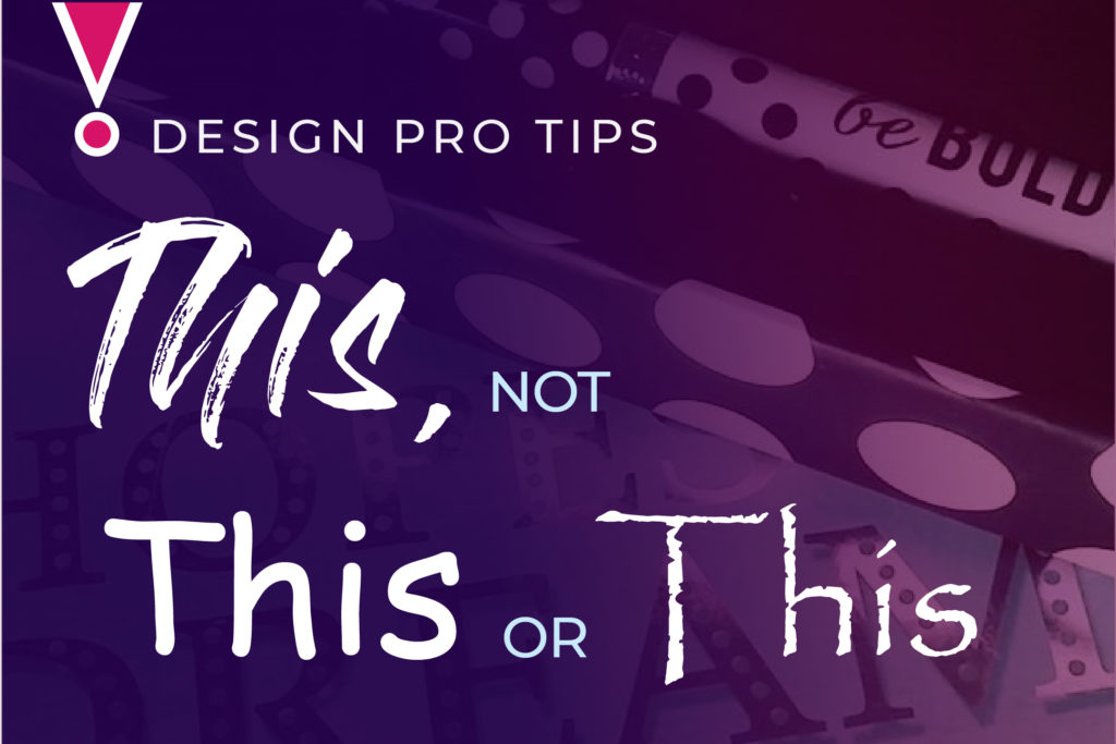
There are hand-drawn fonts that aren't actually script fonts, and some may look okay spaced wide or in all caps. As a rule of thumb, look at it and consider whether it looks like you might have actually hand-written it. Most people don't use wide spacing when writing, so that one rarely looks good. But they might use all caps. If you can set a hand-drawn font in all caps and the words look like words, not like a bunch of capital letters tossed together, you may be okay. Tread carefully, and use them the way they were designed to work.
Pay attention to the way you're designed to be, and honor that.
Terrible fonts like Comic Sans, Papyrus, Impact, and Bradley Hand probably came with your computer.
That's no reason to settle for them.
I'm not going to say it's completely impossible to design something beautiful using one of the fonts on that list. It might be doable, given a tremendous amount of skill and determination. Life is short, and there are better ways to spend your time than wrangling fugly fonts, trying to make them look like something other than a crappy bake sale flyer done up in Word.
There are many places to find something better. Fontsquirrel and Creative Market tend to be where I go first, but there are many, many others. The point is, it's worth looking for something that serves you AND your business. You do want to make book sales, right?
I'm picky about font choices. But in my actual life, the training to settle and just try to make the best of what's in front of me runs pretty deep. I need this reminder a lot: The choices you can see right in front of you are not your only choices.

Font effects. Blech.
When you’re putting text on a background that’s too busy, or has light & dark areas, it can be a challenge to get your text to contrast against the background enough to be readable. A lot of people rely on effects to make up for that. And I’m not saying they can never look good, just that it always looks better when you can find a way for the background and the type to work without looking so forced. It's incredibly easy to get fancy font effects wrong, so if you must have them, you'd probably be better off leaving it to a pro.
Bonus tip: outlines, hard drop shadows, and 3D effects look especially goofy on thin, lightweight fonts. Don't do it. If you're dead set on that beveled text effect, pick a heavier weight of your font. Please? For me?
If it isn't working, don't force it. There's probably a more graceful way to go.

Readers' eyes need to be shown where to go. I know, we'd all love to assume they're eagerly waiting to gobble up every word, and take it in the way we meant it. But is that how you read? I don't.
We're skimmers. We look for visual cues about what's the most important point, and if there aren't any, we often just move on. Only the truly dedicated will wade through a wall of words without headings, subheads, and pull quotes to guide them (and give them breaks to assimilate the info).
It's at least as essential to lead the way on something like a book cover or social media graphic, where you have very few words (compared to a book or a blog post) to make your point.
The words themselves talk to thinky-brain, but the visual way the words work together with the image - that goes straight to the gut. You're sneaking your message in under the radar before they even read it.
Put the emphasis on what's most important. And don't assume people know - lead them there. Everything points to what matters.