I've been scouring Amazon, looking at book covers, and I decided to make one over just for kicks.
Let me be super clear, because I hate misleading content: Dr. Patty Ann is not a client. She didn't ask me to do this, and this makeover is not official or connected with her in any way. Before I stumbled across this book I had never heard of her, and I guarantee she's never heard of me. I did this cover makeover to give you a little demo of how I work, and show you what to look for in a cover that's designed to sell. Got it?


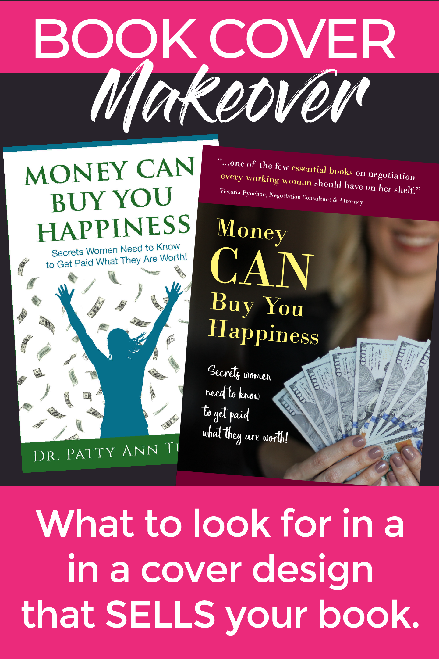
First of all, I don’t even remember all the twists in the rabbit hole that led me to this particular book. And I’m not sure why it called to me to play. It’s a small press, not a self-published book, and it’s not the worst cover I’ve seen by any stretch. But it’s kind of “meh”. A bit bland. And the typography is boring. You would think with the word “happiness” on the cover, and money flying like confetti, there would be some kind of emotion stirred up. But I didn’t feel any, and I don’t REALLY know the tone or genre of the book at first glance.
I wanted to give it more clarity, and more punch. The illustration is bland and generic, and it doesn’t really suggest a woman taking control of her earning. It looks a bit like this might be a book about the Law of Attraction - which would be fine if it was, but it isn’t. So right off the bat, that attracts the wrong readers, and misses the right ones. That’s how you get one-star reviews, people.
A quick search for “women and money” on pixabay brought up an image that’s actually quite fitting. I liked the focus on the $100 bills in the model’s hands. She’s smiling and happy, but you don’t see her whole face, and with her face being part of the out-of-focus background, it’s easier to cast yourself into her place (even those of us who aren’t young, thin, & blonde, thankyouverymuch). She’s a placeholder, and those could be your $100 bills. You deserve them!
The title is obviously meant to contrast against the old cliche that money can’t buy happiness, so I wanted some emphasis on the word “can”. The original just reads kind of monotone. Putting “can” on its own line, bigger and in all caps, makes that emphasis a lot more clear.
Since I’m not actually working with the author, I obviously can’t really dig in and get to the heart of her brand, audience, and goals like I normally would. But I still wanted to get a little bit of a feel for who she is and what she’s doing, so I Googled her & found her online presence. Now, the look of her Relationship Toolbox website is a bit dated, but I loved a picture of her talking on a radio show - she’s got the headphones on, and one of those big radio microphones in front of her, and just the greatest smile on her face. I checked out some of the video segments she has up on her blog, and was surprised and delighted by her accent. New York? Wherever she’s from, she presents as professional and put-together, smart, feminine, but also no-nonsense, tell-it-like-it-is. She reminds me a little of Judge Judy.
That impression influenced my font choices. Sans serif didn’t feel right - too stark, too androgynous. I definitely didn’t want to go with the Trajan font from the original cover - it’s overused, and suggests movie posters and fantasy fiction. (Seriously, so many movie posters. Check out this hilarious video about exactly that!) The Bodoni font I chose ended up giving the right combination of class and warmth.
For the subtitle, I used a handwritten font to make it feel more personal. Something about the word “secrets” made me want to suggest a certain intimacy.
This isn’t some obnoxious sales guy screaming about how he’s going to give you the secret to becoming a millionaire overnight for just 15 low, low payments of $999.95.
This is a graceful mentor, inviting you to lean in for a conversation. But at the same time, the author is a mature, straight-talking woman, not afraid of a little tough love - so I didn’t want to go too “girly” with it. A lot of the handwritten fonts that are super popular right now felt way too whimsical with their jumping baselines and quirky angles. I tried quite a few before settling on Eufoniem One. Just informal enough.
Dr. Patty Ann has a quote about this book in a rotating banner on her website, and I decided to pull part of it for the front cover. It gives some insight into one of the book’s key selling points - negotiation techniques women can use to get paid what they’re worth - and it adds some authority and social proof. I punched it up a bit further by highlighting the phrases “essential books” and “every working woman”. Later in the process I discovered that this quote is already on the back cover of the book, along with a few others. But not everybody will look at the back cover. Putting this quote on the front tells the right readers for the book why they should even pick it up in the first place.
Finally there was the question of color. A lot of money books use green and/or yellow, and my initial draft started with a green overlay over the photo, filling the entire cover. But it was just too cold and dank. It crushed the “happiness” promise and didn’t feel like the author’s vibe.
Dr. Patty Ann uses pink and red on her website. Lots of bright red on a financial book can bring up some unfortunate associations - “in the red” is not where you want to be - but going a little cooler and a little darker, with more of a maroon shade, brought in warmth and vibrance without setting off those jangling alarms. Using a pale yellow for the title made it really pop, and made it easier to read even at thumbnail size.
So as you can see, a lot of thought goes into creating a design that sells vs. one that’s just made to look nice. A design that looks professional and sells your book isn’t going to happen by accident - and if you don’t know what to look for and you haven’t hired an experienced pro, it may not happen at all. And then you’re stuck with a cover that fails to connect with the people you’re trying to reach, which translates to lackluster sales and a whole lotta disappointment.
Bringing that thought process together in a way that looks appealing and professional isn’t easy, but it’s doable. (Hint: Avoid common typography mistakes that scream amateur - I’ll share more about that in another post coming up soon.) Whether you’re going with the DIY approach or hiring a designer, here’s what you need to think about in order end up with a cover that sells:
No matter how pretty your cover is, or how much you like it, if it isn't designed to actually sell your book, you’re missing the mark.