The other day I stumbled across this article about getting your book cover done on the cheap, part of a series called "Self-Publishing on a Shoestring". The first part is great, well-written and smart, and it's awesome to see someone who is NOT a designer talking about how essential a great cover design really is.
And then there's the bad advice at the bottom. Now, in her list of ways to get your cover done with a tiny budget, there are some good ones. I'm not sure the pricing is up-to-date, but a good pre-made cover can be a blessing when you really can't afford a custom one. It still might not be the best cover for your book, but it will be a huge step up from most of the DIY book cover options out there.
The rest of the list...erm, risky. The design prices she's quoting are CLEARLY not based on working with an experienced pro. Yes, you can get a relatively cheap book cover design by having an artist typeset your book title & name onto an image you supply. It might work. Or, you might end up with something like this cover the author got on fiverr.
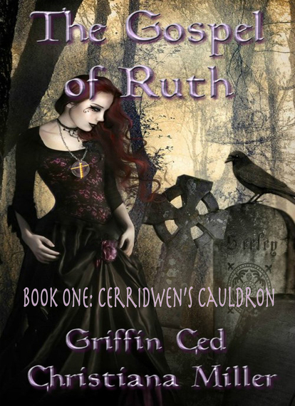
The author couldn't believe she got this cover for $5. I can. Don't get me wrong, I've seen worse; but you're not going to get a great cover for the price of a latte...unless you're buying that latte for a great cover designer who really, really, REALLY loves you.
I love you, but I still need more than a latte to design your cover.
Let’s take a look at how this book cover could be so much better with professional help.
There's nothing strong or compelling about the way the words are laid out. They're not working with the image either. Good typography pays attention to its surroundings and works in harmony with them by using contrast, common colors, similar shapes and moods, and placement that is designed to look like it’s part of the image, not just slapped on top of it. This title isn’t doing any of that. So sure, let's make it look like it’s floating and made of puffy paint!
Bad typography is so rampant everywhere that I had to write a whole (epic) post about the 5 common font mistakes that kill your design.
The vertical spacing is awkward enough already, but the letter spacing on that subtitle is SO awful. You can't just pick a font, type up your words, and call it good. Especially with a (fugly) font like that one.
See the double Rs in Cerridwen? See how that (fugly) R is designed in a way that makes whatever letter is to the right of it look further away? An experienced designer knows about kerning & fixes that. Plus, the font is stretched too tall, making it look squished on the book cover, and even more difficult to read.
Setting the authors' names in the same (awful) type treatment as the title (and SO BIG) makes it harder to know what to focus on right away. What am I supposed to be looking at here?
Usually you want that to be the title, unless you have a huge following and people are going to buy the book based on name recognition. Either way, you do need to pick one "most important" thing. Making everything look important means nothing does.
Lavender text. On a warmish grey background. Nice. And by nice, I mean, no. Don't do that. The colors are juuuust different enough to clash, but not different enough to create any real contrast. Ugly AND hard to read.

Here’s a pic to show you what I mean. The top shade is the predominant background color at the top of the book cover, and the bottom one is the color of the trees. The lavender stripe is the text color. See how that lavender isn’t significantly lighter or darker than the background?
And that color clash - blech. The “tree” shade has enough gray in it to be at least a little bit harmonious with the muted lavender, but the overall background color - no. And the truth is, that whole area up top isn’t light enough OR dark enough to work with.
Contrast is hard to achieve against a muddy middle range like that. A better solution would be to move the title, subtly darken the top of the image, and put the author names there. More on that below.

I couldn’t find the original on Amazon, but searching for the authors brought this up. It appears the title and cover have been updated to this version. It's definitely an improvement, but the title and the authors' names are still fighting it out for attention, with the subtitle floating oddly in the middle, barely visible.
And what is with cramming the text right up to the edge of the image? I see that a lot in amateur designs. Don't do that.
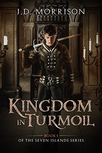
As it happens, I spotted an ad on the book's Amazon page for another book with a cover layout that would have been pretty much ideal. Check out the author name at the top. See how that's NOT HUGE? Less than half the size of the title. And yet it didn’t disappear, because it’s placed well, with plenty of space to breathe.
Dropping the title down to the bottom third of the page leaves the important parts of the scene visible, and has the added advantage of a less-busy, muted background area where it’s easier to find a harmonious, yet contrasting color for the text.
If we applied that treatment to the Cerridwen cover, the title could stand out naturally against the skirt, tombstones, and fog, without cheesy effects or drop shadows.
Make the subtitle one line across the bottom and you'd have a beautiful, elegant cover - like this one.
Look, I get it. Not everyone can afford to hire a professional designer - especially if you’re a DIY author trying to self-publish your first book. But your cover design matters. It helps new readers understand what they’re in for if they choose your book. So make it easy for them. Choosing an image that suits the mood is a big part of that, but typography can make or break the design. Let the typography, and its placement, tell the reader what’s important, so they can make an educated decision about whether or not they should buy your book (and hopefully, they will!).
