
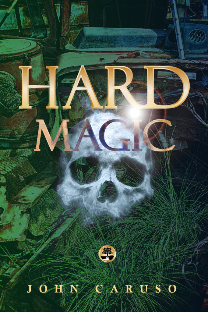
It's been a strange week, filled with reminders of how fragile life and health can be. Due to all of that, and more, I'm feeling a little bit dark - in a true romantic kind of way (Ah! We suffer so beautifully!) and a lot nostalgic. The nostalgia piece is probably what prompted me to look up an old college friend on Amazon. We haven't stayed in touch much, but I admired and adored John, and still do. And look, he self-published a young adult fantasy book! And I don't think his book cover design is doing him any favors.
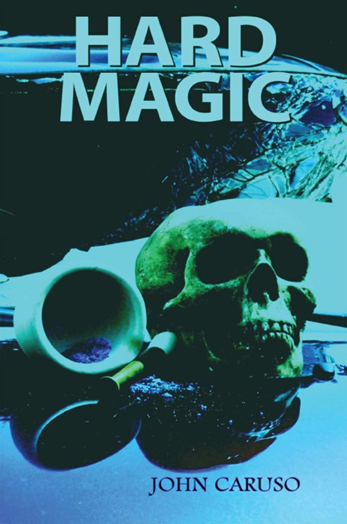
This book is listed on Amazon Kindle in two categories: Paranormal & Urban Fantasy, and Teen & Young Adult (YA) Fantasy. Are you getting that from this cover?
I'm not. The imagery is harsh. The tone is monochrome and murky. It feels really jarring for a Young Adult novel.
The truth is, though, as much as I wanted to flip this cover right away, I didn't want to do it based on assumptions - I wanted to read the book first, so I loaded it up on my Kindle and dove in. And here's what I found: it's full of magic, mystery, and interesting characters, and the cover is definitely, definitely too bleak. I finally figured out what's missing in this image - the hallmark emotions that infuse the covers that LOOK like YA fantasy book: romanticism, and hope. And magic!
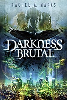
Compare the Hard Magic cover with this other contemporary Young Adult fantasy book. Even when the feel is really dark, with a harsh title like this, there's a romanticism to the darkness - it's a darkness that's infused with magic. Emotions are big, and there's beauty in them, even the painful ones.
By contrast, the cover of Hard Magic looks cynical. It looks like the kind of book where you don't actually like any of the characters, everyone is bitter and empty, there's some murder mystery that gets figured out, and everyone's bleak, depressing life goes on as usual, the end.
I just spent WAY too much of my morning scouring through Pixabay and a couple of other stock photo sites, trying to find just the right dark-haired, chubby teenage boy, just the right car wrecks (because the book actually lists out all the models), and none of those details are what matters when you're trying to catch the attention of a potential reader. See, they don't know those things yet. And after they buy the book, they're pretty unlikely to stop in the middle of the story to write you hate mail that says, hey, that wasn't an Acura on the cover! You suck!
I've told you this before, but it's worth repeating: obsessing over perfect accuracy on your book cover is a huge waste of time. And it's a SUPER easy trap to fall into.
What really matters, what's essential to convey? What do they want to get out of reading? Genre, mood, impact. Precise details have nothing to do with it, I promise. All they'll do is make you feel good, and I'm not saying that isn't important, just that it isn't the MOST important goal for your cover. So focus on what is.
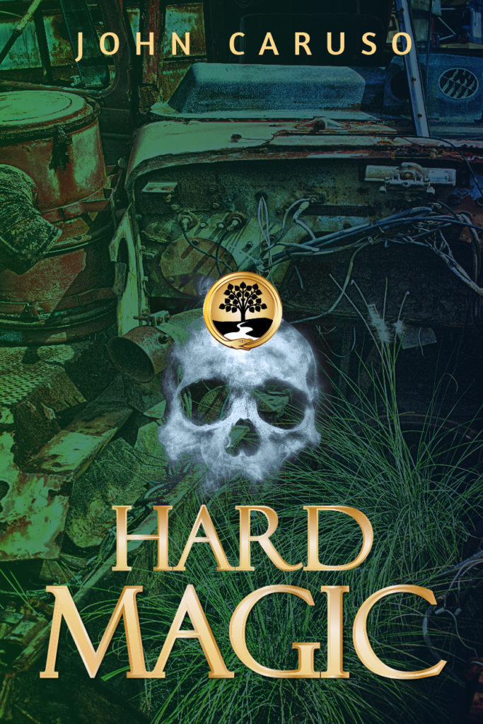
I decided to keep the junkpile/wreckage element and the skull from the original cover. They're both central to the storyline. That isn't a reason to get hung up on having them - remember, the potential reader doesn't know about them yet - but they are kind of intriguing, and I found some images on Pixabay that I quite liked. Adding color overlays and blending effects to the images I found gives them a more illustrative feel, which works well for the genre.
Next, I created the circle/seal element based on a symbol described in the book. Again - the reader doesn't know what that is or why it matters, so obsessing over the exact details is a waste of energy. But using an element like that on a fantasy cover can add to the magical feel, and I wanted to try it.
As much as I'm not a huge fan of text effects like the metallic gradients, outlines & shadows I used on the title, they absolutely scream Fantasy. You can hardly find a fantasy cover without them. And since we only have seconds to convey genre and mood, that's a shorthand we want to take advantage of. Using gold also adds contrast (easier to see/read) and warms up the tone. Remember that element of hope that's a hallmark of Young Adult fiction book covers? You don't get that from a cold, dark monochromatic image. You need some warmth and light.
This draft is okay. The elements of a better cover are there. I was THIS close to skipping this part, showing you a more refined version. It would have made me look better, and boy howdy do I like to look better. This open vulnerability crap is HARD for a recovering perfectionist. But the first draft being "meh" or even flat-out awful - that's part of the process.
While it's already leaps and bounds more genre-appropriate than the original, and well on its way to being an effective and beautiful cover, it’s still fugly. And for full transparency, I'll add that this is the first FINISHED draft. This is the first design that felt promising enough to complete. There were numerous false starts with other images that weren't even worth bothering to put the title on.
See, thinky-brain likes to get in there and try to pick out images based on thinky-brain criteria. That's what causes that time-suck of trying to get the details perfectly precise: Thinky-brain, trying to be helpful by focusing on the wrong things. You end up with nothing at all, because nothing fits those mistaken criteria well enough. Or, you get images that don't work visually or emotionally, even if they are technically "correct", and then you waste more time trying to force them to work.
Yep. I still fall prey to that ol' thinky-brain glitch sometimes, and that's after a long history of knowing how to surrender to the flow instead. I can only imagine how frustrating it must be for someone less practiced in design, who's probably going to stay stuck there, trying to force everything into place with thinky-brain running the show.
Anyway, once I tossed those false starts aside, the elements came together. But the layout is just bad.
The author name at the top and title at the bottom can work really well if you're showing a dramatic background scene. But here it just looks bottom-heavy.
And then there's that symbol, stuck right in the middle of the forehead, looking derpy. It might work on a plainer background, but that wouldn't really be right for the genre.

And I didn't touch the kerning (letter spacing) on the title, which is why the spacing between the "I" and the other letters - the "G" especially" - looks wonky. The "R" and the "D" are too far apart, too. These aren't details most people would pick up at first glance, but they create a vaguely dissatisfying feeling - something seems off, and just a hair unprofessional.
This one solves the issues with the first draft, so it works better visually. But now I'm starting to think it's too creepy. What's going on with that skull? It feels ghostly, which is not right for the story.
Dammit. When I went to bed last night, this was a good cover. Now, I think it might be a good cover - but not for this book.
I’ll admit, designers can be the worst. Nit-picky? Yup. Never satisfied? Absolutely. Work I was totally happy with YESTERDAY isn't good enough for me now. I'm sure I could do better. I want it to be better.
When you're not sure, that's a good time to test. And I don't mean post two or more versions on Facebook and ask everyone which one they like. That's beyond useless.
Useful testing asks the kind of people you're actually trying to reach. And you don't try to lead them, or ask something nearly pointless like "do you like it?". What you want to know is why. Ask what they felt when they experienced it. Ask what their actual experience is, so you can tell whether it's the one you meant.
Based on an admittedly tiny and very informal poll, the vibe on my cover flip isn't veering off-target like I feared it was. I'm getting Urban Fantasy, Sci-Fi Mystery, and (my favorite), MacGyver in the jungle. Not a scrap of ghostliness. That last one might mean I need to crop the background image differently so there's more emphasis on the junkpile and less grass, but overall, the vibe is headed in the right direction for the contents and feel the book delivers
(Yes, you have to look at genre conventions and category norms.)
There are a few outliers, but the majority of Teen/YA Paranormal & Urban Fantasy covers have at least one person on them. But unlike Hard Magic, most of them also look like a romance of some kind. The Contemporary Fantasy subcategory might be a better fit for this book than Paranormal & Urban.
According to KDSpy, Contemporary is slightly less competitive anyway, so there could be a better chance of getting seen, and there's definitely more space to look like something other than a romance. More variety. More outliers. More covers without a person on them that aren't Twilight or trying really, really hard to look like Twilight.

(Books that are trying to be Twilight could be their very own subcategory. Here's a great example: Twilight with angels instead of vampires, and definitely a DIY cover. )
If you're not familiar with that the Twilight cover looks like, here's the original.
The similarity is totally unintentional, I'm sure.
And on that note . . . I want you to know the reason for all of the criticisms and takedowns. It isn't to be mean. It isn't even because snark is so much fun.
But mainly, it's because I want authors and entrepreneurs to have better-designed book covers and brands. I want better quality and better results. I want you to have what you want, without having to scramble so damn hard for it all the time. I want to do what I can to support your dreams. It's all about the love.