8 essentials for the interior design of your next book (with real-world examples)

January 7, 2019

Every time I hear the interior design of a book referred to as "book formatting", it's like this:

It's the commonly-used term, so I'm pretty much just going to have to suck it up and get used to it, but still...ech.

Book Formatting vs. Book Interior Design

To me, book formatting is about the technicalities of telling your document how to display. Marking your headings and subheadings, page breaks, all of that. That's an essential job, and very time- and labor-intensive, but it should follow an actual design process.

How will you lead your readers through the material?

The Interior Book Design Answers That Question.

I get it - if you have a limited budget for publishing, the interior isn't where you should spend much of it. Cover design and editing give you the most bang for your buck, and marketing is a pretty critical piece of the puzzle, too. But - especially for non-fiction - giving the look of the interior some extra love can lead to much better results for your readers.

Here’s how, and what you can do if getting my full inside-and-out design package isn't in the budget for your next book

Good interior book design is like a movie score.

When it's done well, most of the time you don't really notice it. It's there in the background, not calling attention to itself, and it's carrying a lot more of the mood than you realize.

When it's done badly, you notice.

  • It jangles.
  • It sets the wrong mood.
  • It's too quiet.
  • It's too loud.
  • It's awkward.
  • It gets between you and the experience you were trying to have.
  • It keeps the material from getting through.

With fiction, your goal is for your readers to stay inside the story. Pre-designed templates are perfectly adequate for most fiction. But if your story hops around a lot - point-of-view changes, flashbacks, etc. - you'll want to give a bit more thought to how you're going to make that clear to the reader. Confusion is frustrating, and it pulls them out of the story. Do that enough times and your book turns into one of those books people want to throw across the room.

Don't publish a throwing book.

The other key consideration for fiction is mood. What's the mood of your story? Playful? Gritty? Romantic? Nostalgic? Sarcastic? Visual elements inside the book can enhance that feel, giving your readers a deeper immersion. Your chapter openings, section dividers, icons, flourishes, and title font choices can really enhance (or totally screw up) the feel you're going for.

Remember what I said about picking a direction and going all in? That applies to the interior of the book, too, not just the cover

Designing your non-fiction book the same way as fiction can absolutely ruin it for your readers.

So last week, we were talking about The Secret Watch, and I made cover design recommendations based on the Amazon categories it's currently competing in. The assumption was that this book wants to be a business parable. Then (because the author is my client, business coach, and friend) I got a bit more of the backstory and realized there was always a different direction it could go (Inspirational Fiction), and the existing design is already well-suited to that direction

So there's more than one way we could go all-in on the interior.

Interior section from "The Secret Watch", with a simple layout showing 2 paragraphs, an inscription, and the page footer

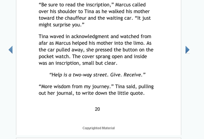
Here's a little section from Amazon's "Look Inside". It's clear and readable, and there's nothing about it that makes me want to stick a fork in my eye.

But a more focused design could take it further.

Interior Book Design for a Business Parable

Here I've recreated the same section the way I might handle it if we were going all-in on the business category. I kept the clean sans-serif body font, but adding a couple of touches makes it look more professional and business-oriented:

  • Justify the paragraphs
  • Decrease the font size
  • Increase the leading
The same page as shown above, redesigned to look more like a business parable and lead the reader to absorb a lesson from the inscription

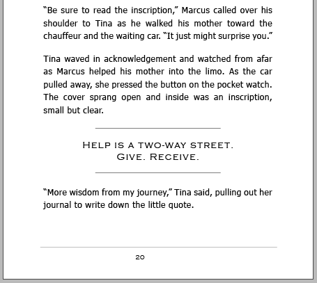
And because we're treating this as a parable with lessons the reader is meant to take in, I pulled out the inscription to make it really stand out.

  • The Copperplate font suggests engraving.
  • Paragraph rules above and below set the quote apart from the rest of the text.
  • Increasing the font size does, too.
  • Widening the letter spacing and giving plenty of space above and below gives the quote plenty of room to breathe.

And for one more subtle little touch, I used Copperplate for the running header and footer text - the titles in the header (unseen in this view) and the page numbering in the footer.

Making the inscriptions stand out so distinctly really puts the focus on the lesson, but it does something else for the reader, too - it makes it easy to pick out the inscriptions if you're skimming for them later, after reading the story through once to get the gist of it.

What going all-in on a more romantic inspirational fiction style might look like..

The same page section again, this time redesigned to look like inspirational fiction

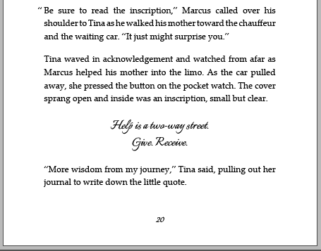
For a more romantic, inspirational fiction style, just a couple of simple changes make for a completely different mood. I've gone with a serif font (Palatino) for the body text, and a script (Italianno) for the inscription. Keeping the inscription closer to the size of the body text lets it stand out just enough to feel special, but not enough to pull you out of the story.

Simple tweaks can make a big difference in the way your reader consumes or engages with the material.  Here are some other things to remember:

  • Script fonts can be hard to read, so it's important to choose one that's still fairly simple and clear. You can get away with a little bit more in titles and headlines, but within the story, clarity is key. We want to enhance the feel of the story, not pull them out of it.
  • Don't get too fancy with body text - again, because it needs to be easy to read, but also because your body font choice may not carry over to the Kindle edition. Kindle readers can choose from a short list of fonts as well as changing the size and spacing.
  • Which means we have two choices for how to handle the inscriptions for the Kindle edition. We can change it to a simple italicized version of the body text, or we can make it an image that's inserted into the text. I like the image route because it keeps more of the visual styling intact, but you've GOT to make sure you set the image to flex with the font size, or it will look really goofy when they change to a huge font and your image stays the same size. And the other MUST is to include alt text that says the same thing as the text in your image, so that people who are relying on text readers (vs. being able to see the image) aren't left behind.

I'm going to stop here before we end up going way, WAY down a technical rabbit hole. As a book designer, it’s my job to know all the details, but it can get kind of techy and geeky to consider things like:

  • All the technical pieces to setting up your document once you have the styling established
  • A list of the expected elements in a book interior and what to put in them
  • The industry terminology - Front matter! Back matter! Verso! Recto!
  • All the little steps you take to actually get there

And that’s just the tip of the iceberg. Seriously. That rabbit hole goes DEEP.

8 Essentials of Good Interior Book Design

Thankfully,  we've been talking about the book interior design, and the above list is mostly about the book formatting. Does it all matter? Yes. And I'll lay it all out in a blog post soon, for those that really need to know all the details. But for us, for now, the essentials are:

  1. Establish the design style first, based on your goals for the book and how you want it to affect your readers.
  2. Set your document size to the trim size of your book. Leave generous margins.
  3. Add your header & footer with page numbering, book title, chapter titles, etc.
  4. Set the design elements up as styles in your document. Body text, titles, chapter titles, subtitles, headings, and so on.
  5. Go through page by page and apply the styling to each element.
  6. Add manual page breaks between the chapters. Use an "odd" page break to make sure your chapters open on odd-numbered pages.
  7. Start the proofing process - generate a PDF from your document and go through, page by page, to check that all your styles are applied and nothing came out weird.
  8. Repeat till you're done.

I'm not gonna lie to you - it's a lot of work. Especially piled on top of someone who's just trying to get a good book written... not to mention edited, covered, published, and marketed. The good news is, you can hand off parts of that workload, depending on your budget.

Interior Book Design Options For Every Budget

  • You can buy a template. This works especially well for fiction, where you don't have extra elements like tables, lists, call-out boxes, and so on - the ways you help your readers assimilate all the info you're giving them. You still have to go through and apply your styles, but the design elements have been set up based on a general theme. This is going to be your cheapest option.
  • If your book is more complex than typical fiction, or you just want something custom, you can hire a designer to do custom styling and do the rest of the steps yourself.
  • You can recruit friends to help with some of the steps because they love you. Or because you bribe them with beer.
  • You can hire a VA to tackle some of the steps, like the page-by-page applying of the styles. You still have to manage the process, but you'll save some hours of technical work.
  • You can hire a designer to do the whole thing. It is not cheap. But it's the most hands-off you can go, and my clients tell me it's worth every penny!

So just like all the other projects hanging over your head, you have options. The trick is to find the one that's right for the exact combination of time, energy, and budget you have to put into it.

Sign up for a free Instagram grid template!

And stay on the list for design insights (some of 'em pretty snarky, #sorrynotsorry) from a 20-year pro who's completely in love with online business. Plus, people on my list get a new template (or some other freebie) at least once every month, and they're always the first to get in on special offers & goodies.
* indicates required
Privacy PolicyTerms of Use © 2024 digiVisual design
I'm a weird introvert.
This is as social as I get.
linkedin facebook pinterest youtube rss twitter instagram facebook-blank rss-blank linkedin-blank pinterest youtube twitter instagram