

Images are faster than thought - something either catches your attention and gets you curious to learn more, or it doesn't. When it comes to a strong-selling book cover design, your image matters. While most of the authors I work with are entrepreneurs using non-fiction books to grow their reach, I'm having fun with some fiction book cover design makeovers this month in honor of NaNoWriMo.

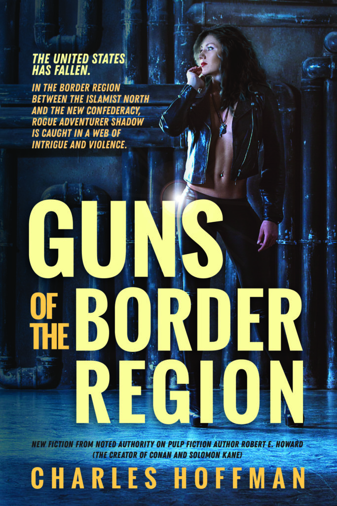
Guns of the Border Region was nominated by my husband for a cover makeover. It’s written by a Facebook acquaintance of his. At first glance, I assumed it was some sort of history text about a pretty niche topic. Imagine my surprise when I read the description and discovered that this is a pulpy, speculative fiction book that would best fit in a "post-apocalyptic" or "men's adventure" category.
Would you get that from this cover? If you were browsing for an exciting read, would this grab your attention at all? It looks like a corporate report, or something equally dry.
One of the ways Createspace (which used to be Amazon's print-on-demand platform) made it easy to self-publish was by offering these book cover templates. Plug in your text, choose an image (or provide your own), and boom! Done! Who wouldn't want that?
Truth is, though, what feels easy now can lead to more hardship later, when you're struggling to sell a book because nobody who likes your genre can tell they'd like your book.
Unfortunately, the Createspace book cover templates were all this awful. (I've heard a theory that they were intentionally awful, so people would be more inclined to use the book cover design services Createspace used to offer. It sounds plausible.) But, when they quit offering that service, Createspace still left these awful book cover templates around for people to use. Ick.
Amazon recently brought all of its self-publishing services under the KDP (Kindle Direct Publishing) roof and did away with Createspace. The book cover templates offered in KDP are a bit more modern, but still very, very limited.
Templates are designed to best suit a specific number of words, of a specific length. Anything too far outside of that risks looking weird and out of balance. This cover template was designed with space for a subtitle, which wasn't applicable here, so the title floats oddly high within the color block it's placed in.
Unless you're using a genre-specific template, they're often designed to accommodate a wide range of subject matter - which means they express no mood whatsoever. Like this template, with its corporate font and overall bland feel.
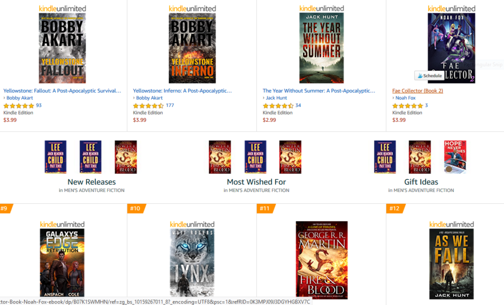
First, I checked out the book page on Amazon, which is where I found out that this book is a lot more excitement-packed than it looks. (I mean, it almost HAS to be more exciting than that cover looks, but seriously, we're talking action, intrigue, and sexy people. None of which is suggested by the DIY cover.)
Next, I scrolled down to the "Product details" section to find out what category this book is competing in.

A quick jaunt over to the bestsellers in this category showed me that:
Notice that not one of these best-sellers looks like a corporate report.
Finally, I checked out all of the info I could find (still on Amazon) about the author. What stuck out the most: the author is a recognized authority on pulp fiction author Robert E. Howard, creator of Conan the Cimmerian - better known to non-experts like me as Conan the Barbarian (who talks like Arnold, heretical as that may be).
That's a pretty cool distinction, and it gives people who are into that kind of thing an inkling that they'll probably like this book. Or it could, if it appeared anywhere on the book cover or description, instead of buried in the "about the author" section - which only gets read by people who already have a reason to be curious.
It's pretty common to think that your cover should stand out in a way that's really different, unique and original. Not if you want the book to sell. People need to recognize what they're looking at before they'll even be curious enough to pick it up / click to learn more. When I'm designing for a client, I've read the book first, so there's no guesswork involved. Since that's not the case here, I toyed with multiple moods.

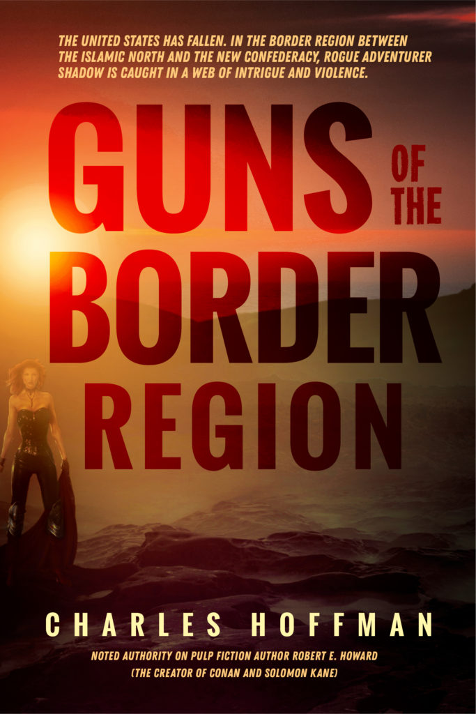
Large, bold, sans-serif text, a distant figure, contrast, and drama mark this as an exciting fiction read. At thumbnail size, it looks like it belongs in the category. At full size, the setting, the blurb at the top, and the figure all work together to give you a little taste of what's inside.
Looks a bit more like it might fit here, yeah?
Now, I did change the woman's haircolor from blonde to dark on all of these covers, but in general, it's a mistake to hung up on detail and accuracy, spending a lot of time and money on making sure the cover looks exactly the way you've described some scene or person in the book. New readers won't know or care, and that's who your cover needs to attract.
If your book gains a huge, dedicated readership, go ahead and release a special-edition cover later, where you spend a small fortune on a super-custom photo shoot with the perfect, hand-picked-by-you model, in an outfit made by a costume designer to your detailed specifications, in a setting that's exactly as described in a critical scene, just to please your huge fan base. At least half of them will still think you got it wrong.
Because here's the thing: in many, many ways it's a better cover than the first one. The color contrast between the blue-hued background image and the yellowish tones of the text - plus the woman's face and the flash of skin under her jacket - makes it super dramatic and eye-catching. The direction of the woman's gaze leads the eye toward the descriptive blurb. The placement of that blurb works really well against the background. So does the title, for that matter.
Like I said before, I haven't read the book. Reading the book is definitely part of the process when I'm working with a client, but for this demo I had to work with what I could grab online - the description, plus the brief "Look Inside" section on Amazon. From what I did find, I suspect the tone of the rest of the book leans very outlaw & rural vs. industrial & urban. So this cover, gorgeous as it is, would probably lead readers to disappointment. They'd pick it up expecting one thing, and find something else. Which means either they'd click in out of curiosity, then read the description and not buy; or worse, they'd buy, but then leave a crappy review.
Neither of those things is what I want for my authors, obviously. So we're not going to promise Ariel and deliver Jaynestown. (You Firefly fans know what I mean. For the rest of you, poor dears, we're not going to suggest city and deliver country.) I'm reasonably certain this book leans Jaynestown, so the cover should, too.
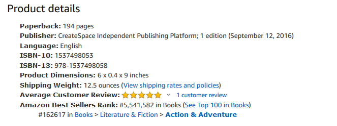
One more version before we put this puppy to bed. What's notable here is this: in-your-face contrast isn't the only way to make your title a focal point. Here I used transparency & difference effects with the text instead of a contrasting color that pops out.
I admit I got really into the subtle way the border between mountains and sky plays through the letters in the word "border", because I geek out on stuff like that. Most people won't notice, but it all contributes to the mood, leaning more toward sunsets & distant vistas than either of the other versions I did.
It's all about understanding the experience the readers are going to get from the book and giving them a taste of it on the cover. Not the literal story, but the feel of it. That's all you have time for in the instant something catches your eye. It isn't an intellectual exercise, that part comes later. It's a gut-level yes or no, and you want to give them what they need to make that call. A boring template cover doesn't cut it.
 Literature & Fiction > Action & Adventure"/>